
HomeMind Graph

Get started

A map of what yourproduct actually does.

Mind Graph reads your help articles, blog posts, help flows, releases, requests and roadmap items, and comes back with a node for every capability you ship, wired to the ones it relates to. The competitor comparison grades against it, and the whole map is exposed over MCP.

Book a demo →

Builds itself

Read out of your help articles, blog posts, flows, releases and requests.

One node per capability

Grouped by category, wired to whatever it relates to.

Shipped vs requested

Capabilities you ship counted apart from ones people only asked for.

Built, not drawn

Nobody has time to draw this by hand.

The graph assembles itself out of what you have already written — the help articles, the blog posts, the help flows — and comes back with a node for every capability it can find in them, counted and categorised. Rebuild it when the product has moved on and it redraws itself.

  • A node per shipped capability, found in your own content
  • Counts for capabilities, connections and the sources behind them
  • A rebuild action for when the product has moved on
  • Ninety days of build history, with what each run added and removed
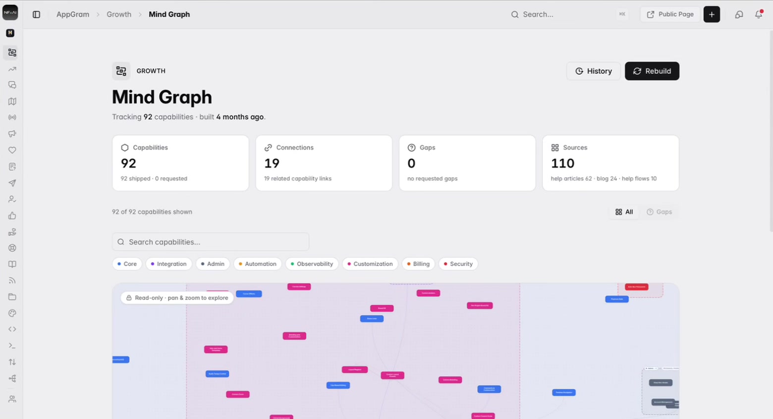
The mind graph at rest: the number of capabilities tracked, the links between them and the help articles, posts and flows they were read from, above a search field, the categories they fall into, and the top of the map itself.

Wired

And which capability leans on which.

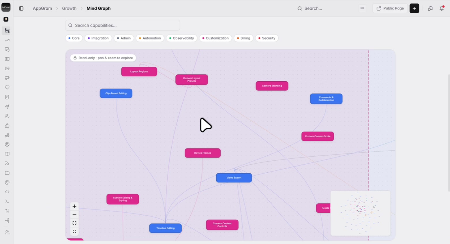
Nodes are joined by the relationships between them, so the features everything else depends on show up as the hubs they are — and the ones nothing points at are just as informative. Pan and zoom around it; it is a map to read rather than a diagram to maintain.

  • Related capabilities joined, and the links counted
  • The hubs are visible — the features everything else leans on
  • Pan, zoom, fit to view, and a minimap for the whole picture
  • Read-only: nothing to lay out, nothing to keep tidy
The map zoomed in far enough to read it: individual capabilities as labelled pills — video export, timeline editing, device frames, camera branding — joined by curved links that converge on the few they all depend on.

Grouped

Grouped the way you would have grouped them.

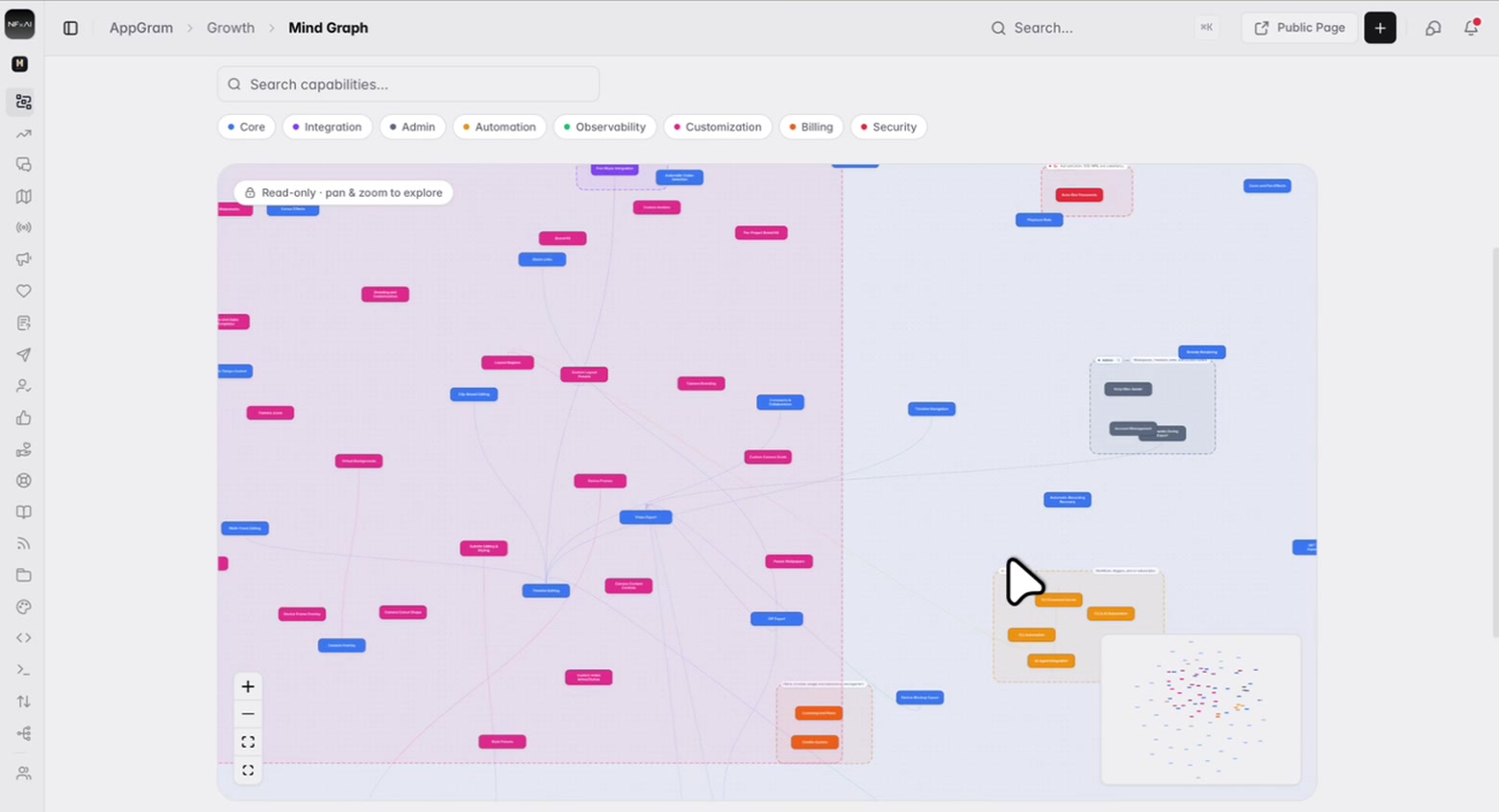
Core, integration, admin, automation, observability, customization, billing, security. Each one is drawn as its own cluster on the canvas with a count and a line saying what belongs in it, so a hundred nodes reads as eight groups rather than as a hairball.

  • Nine categories, each drawn as a cluster with its own count
  • Search the capabilities by name
  • Filter the canvas down to a single category
  • Shipped and requested counted apart from each other
The whole map fitted on screen: the bulk of the capabilities in two large tinted regions, with smaller outlined clusters for admin, automation, security and billing standing apart, each tagged with its category, its count and what belongs in it.

What it feeds

The reason it exists is everything else.

A map of your own product is mildly interesting on its own. What makes it worth building is what reads it: the competitor comparison grades rivals against your capabilities, blog suggestions draw on what you have not covered, and the projection is available to your own tooling get filed against the capability they are actually about, and recommendations know what relates to what.

  • Competitor capabilities graded against your own map, not against a guess
  • Blog topics proposed from subjects your graph shows you have not covered
  • Capabilities people asked for but you do not ship, flagged as gaps
  • A compact projection of the whole graph exposed for anything else to read
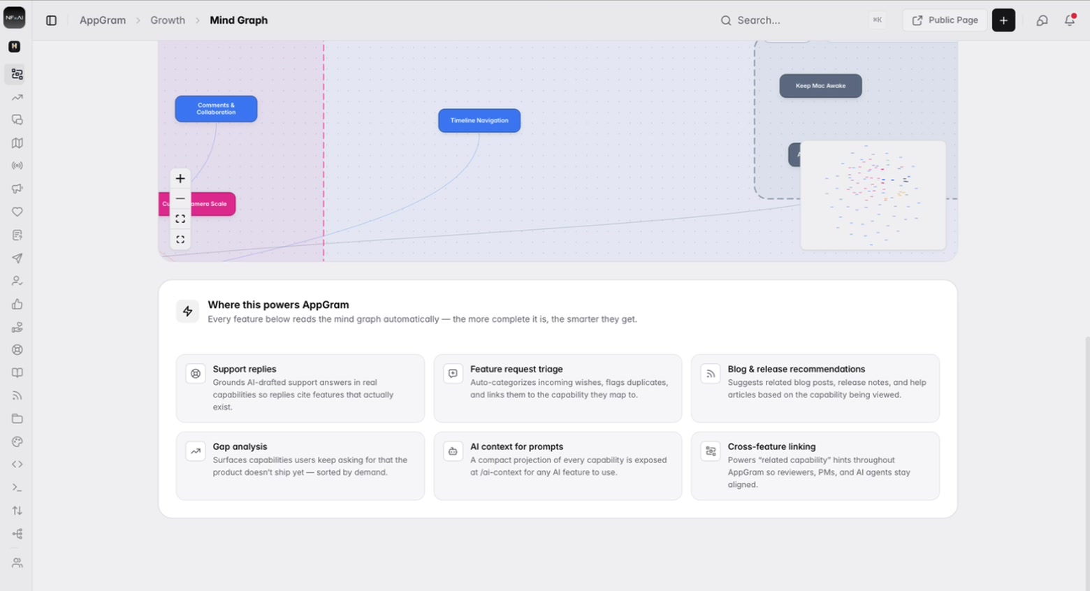
The list of what reads the map: support replies, feature request triage, blog and release recommendations, gap analysis, a context projection for prompts, and the related-capability hints used across the rest of AppGram.

Who uses it

What teams actually do with Mind Graph.

For product managers

Find out what you have actually shipped

Most teams cannot produce a list of everything their product does on request. This one comes out of your own documentation, so it is what you told customers you built rather than what the backlog claims.


For support leads

A list of what you actually ship

Derived from your own documentation rather than the backlog, so it reflects what you told customers you built.

For whoever triages

The gaps, counted

Capabilities that only ever appear in requests and roadmap items are flagged as gaps, so what people keep asking for is visible beside what you ship.

Connected

Mind Graph plugs into everything else you run.

Every module writes to the same customer graph, so data captured here shows up wherever it is useful — no connectors to authorize, no sync to babysit.

See all integrations →

FAQ

What teams ask about Mind Graph.

Where does the graph come from?

Your own content. It reads help articles, blog posts, help flows, decision nodes, releases, feature requests and roadmap items, derives a capability for each thing, and wires the related ones together. The page tells you how many sources went into the build.

Is it something we have to maintain?

No, and that is rather the point — it is read-only. There is nothing to lay out and nothing to keep tidy. You rebuild it when the product has moved on and it redraws itself from whatever your documentation says now.

What are the categories?

Core, integration, admin, automation, observability, customization, billing and security. Each is drawn as its own cluster on the canvas with a count and a line describing what belongs in it, and you can filter the map to one of them or search across all of them by name.

What actually uses it?

Three things today. The competitor comparison grades every rival against your capability map rather than against a guess. Blog topic suggestions are drawn from subjects the graph shows you have not written about. And a compact projection of the whole graph is exposed over REST and MCP, so your own tooling can read it too.

Can we see what changed between builds?

Yes. Every run is kept, and each one carries how long it took and what it did to the graph — nodes added, nodes removed.

Get started

Stop paying for six tools. Run product ops from one.

Everything you were bolting together — feedback, roadmap, changelog, help, support, status, forms — in a single workspace with one API and one bill.

Cancel anytime. Yours to test on real customers.

Talk to sales

Tell us what you're running today and we'll map it onto AppGram.

A real human replies within one business day.