
HomeChat Widget

Get started

A widget that looks likeit came with your product.

The launcher and panel across every page of your portal, styled down to the token — two palettes, your typography, your copy — with the real embed bundle rendering beside the controls as you change them.

Book a demo →

Two palettes

A light and a dark set on every style, edited independently.

Fourteen tokens

Each one named for what it paints, not for where it sits in a file.

Live embed

The preview is the real bundle, not a picture of one.

Preview

The thing beside the controls is the widget.

Most theme editors show you an approximation and let you find out later. This one renders the real embed bundle in the panel next to the settings, so what you are looking at while you pick a colour is what a customer gets when the page loads.

  • The preview is the shipped bundle, not a mock of it
  • Keep several styles and switch which one is live
  • Start from a preset, or build one and save it as your own
  • Light, dark, or follow whatever the visitor's system is set to
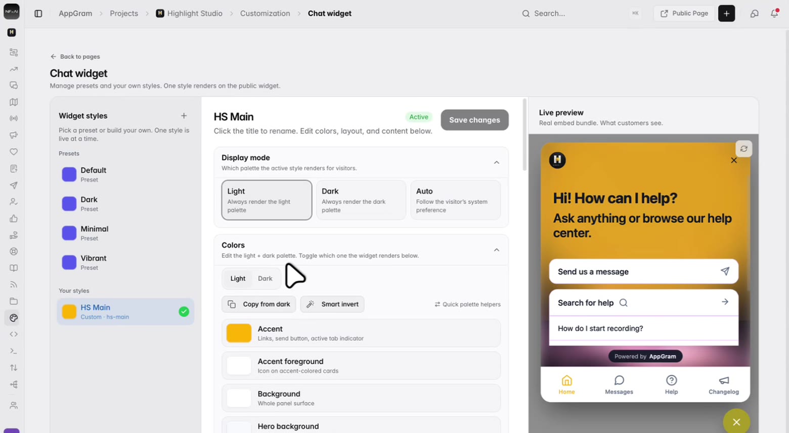
The widget styling page: saved styles down the left with one marked active, the display-mode and colour controls in the middle, and the real widget rendered on the right with its greeting, its cards and its tab bar.

Colour

Fourteen tokens, each named for what it paints.

Not a primary and a secondary and a hope. Every colour the widget uses is listed by the thing it actually colours — the send button, the icon on an accent card, the wash behind the header, the floating launcher — so matching your product is a matter of reading down a list rather than guessing.

  • Accent, hero background, card background, borders, launcher, glow — each its own token
  • A full light palette and a full dark palette on the same style
  • Copy one palette across to the other, or invert it and adjust
  • Typography on the same screen: the family and the base size
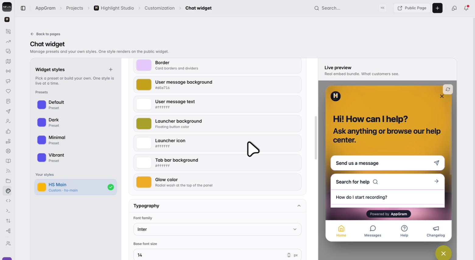
The colour list: each token with its swatch and a plain description of what it paints — the user message bubble, the launcher, the tab bar, the glow behind the header — and under them the font family and base size.

Shape

Where it sits, and how much of it there is.

Put the launcher in whichever corner your product has room for. Turn off the tabs you are not using — and if only one is left, the bar goes away rather than sitting there with a single item in it.

  • Four corners to launch from
  • Home, Messages, Help and Changelog, each on or off
  • One tab left and the bar hides itself entirely
  • Which tab opens first is yours to set
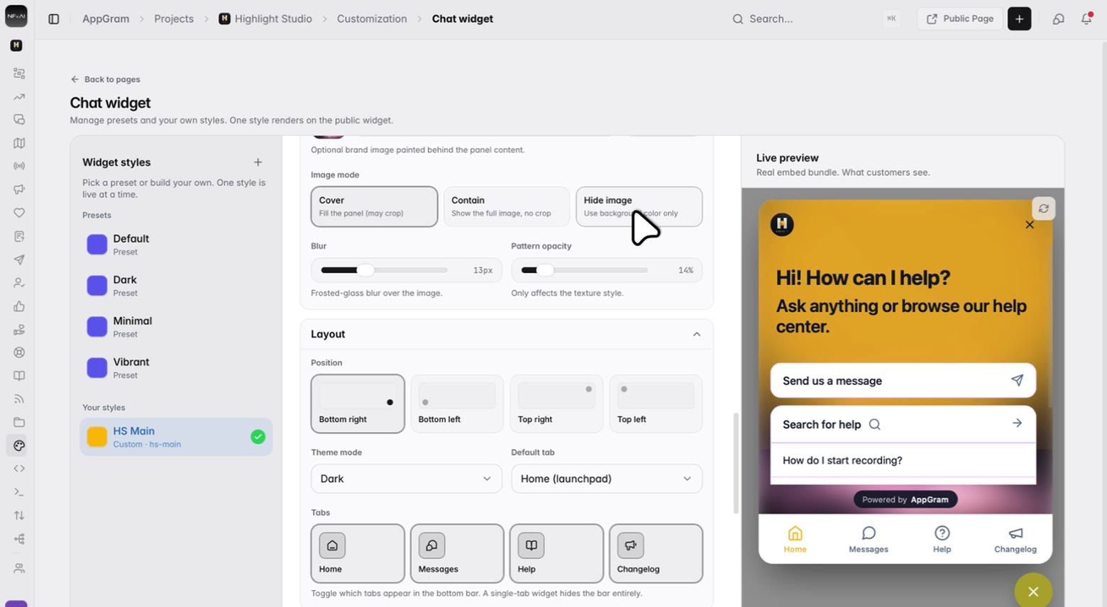
The layout controls: the four corners the launcher can sit in, the tab that opens first, and switches for the home, messages, help and changelog tabs, above sliders for the panel’s blur and texture.

Voice

It should sound like you, too.

The greeting, the line under it, the name on the header and the questions offered up as chips are all copy you write. A widget that opens with your own four most-asked questions is doing more work than one that opens with a blinking cursor.

  • Greeting, subtitle and the name on the header
  • Quick replies as chips on the home tab, one per line
  • Your logo beside the header, and team avatars if you want faces on it
  • A background image and texture behind the panel
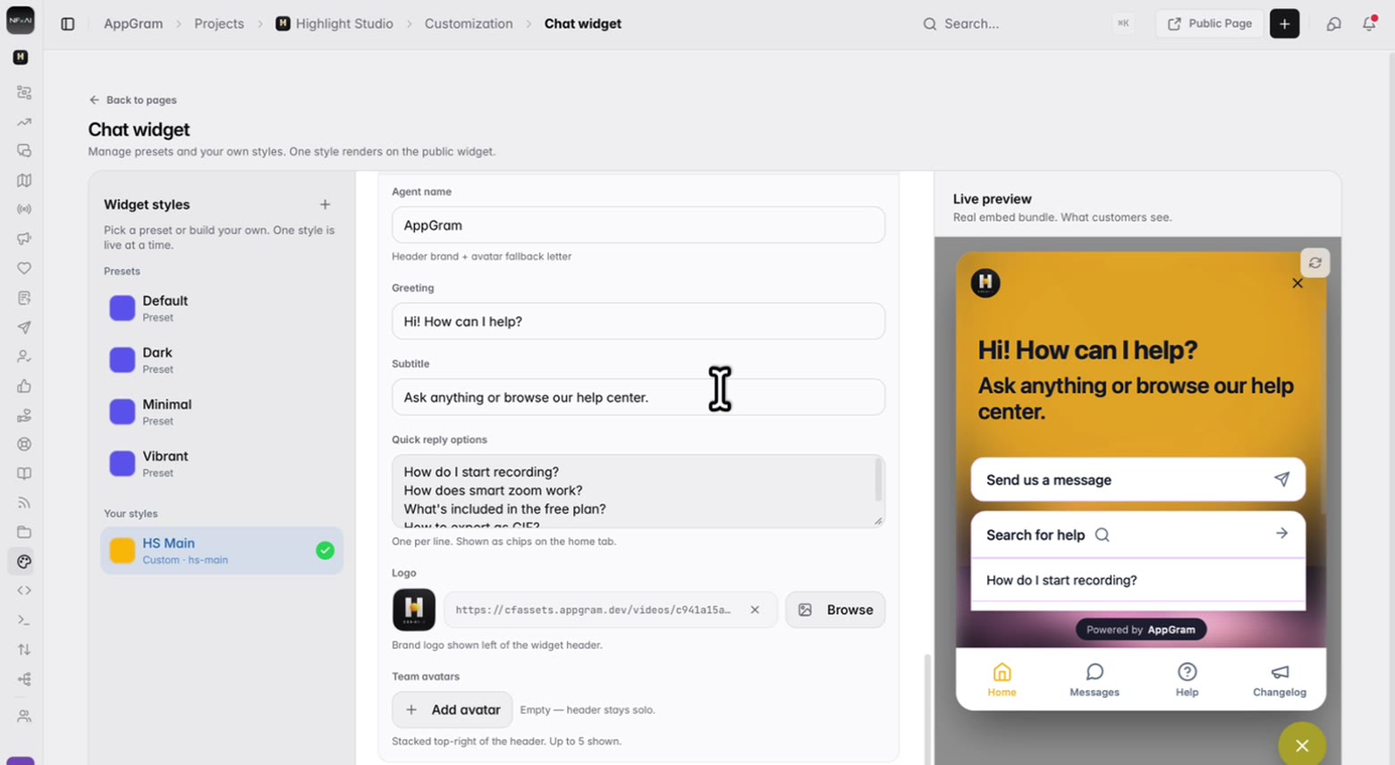
The content fields: the agent name, the greeting and its subtitle, and a list of quick replies written one per line — with the widget beside them showing those exact words rendered.

Who uses it

What teams actually do with Chat Widget.

For product teams

A widget that does not look bolted on

The reason support widgets look cheap is that they are themed with two colours and a logo slot. Fourteen named tokens and two full palettes is enough to make it look like a part of the product rather than a visitor.


For designers

Change it and watch it change

The panel beside the controls is the real bundle, so there is no publish-and-check loop. Pick the accent, see the send button and the active tab move with it.

For support leads

Answer the four questions before they are asked

Put your most-asked questions on the home tab as chips. The ones people tap are the ones worth writing an article about.

Connected

Chat Widget plugs into everything else you run.

Every module writes to the same customer graph, so data captured here shows up wherever it is useful — no connectors to authorize, no sync to babysit.

See all integrations →

FAQ

What teams ask about Chat Widget.

Is the preview actually the widget?

Yes — the panel beside the settings renders the real embed bundle rather than an illustration of it, so the greeting, the cards, the tab bar and the launcher you are looking at are the ones a visitor gets.

Can we have a light and a dark version?

Every style carries both. You edit the light palette and the dark palette separately, and set whether the widget always renders one, always renders the other, or follows whatever the visitor's system is set to. There are helpers to copy one palette across to the other or invert it as a starting point.

How much of it is themeable?

Fourteen colour tokens, each named for what it paints — the accent, the icon on an accent card, the panel background, the wash behind the header, card backgrounds, text and muted text, borders, the user message bubble and its text, the launcher and its icon, the tab bar, and the glow. Then the font family, the base size, a background image with a texture over it, the panel blur, and the corner it launches from.

Can we turn off tabs we do not use?

Yes. Home, Messages, Help and Changelog are each on or off, and you choose which one opens first. If you leave only one on, the bottom bar hides itself rather than showing a single item.

Can we keep more than one style?

Yes. Styles are a library — the built-in presets plus any you build — and one is live at a time. That makes it safe to work on a new look without touching the one your customers are currently seeing.

Get started

Stop paying for six tools. Run product ops from one.

Everything you were bolting together — feedback, roadmap, changelog, help, support, status, forms — in a single workspace with one API and one bill.

Cancel anytime. Yours to test on real customers.

Talk to sales

Tell us what you're running today and we'll map it onto AppGram.

A real human replies within one business day.