
For founders
A bio link that updates itself
Your product link, your latest release and your best testimonial on one page — and it stays current because it is reading the modules you already maintain rather than a copy you pasted in and forgot.
HomeLink Pages
Get startedA bio page with a short URL behind every card and a click count on each, themed to look like yours — and able to pull your latest posts, releases and testimonials in as live cards rather than links away.
Book a demo →A short URL each
Every card carries its own link and its own click count.
Live, not pasted
Blog posts, releases and testimonials read from the modules.
Yours to theme
Palette, font, background, button shape — with a live preview.
The page
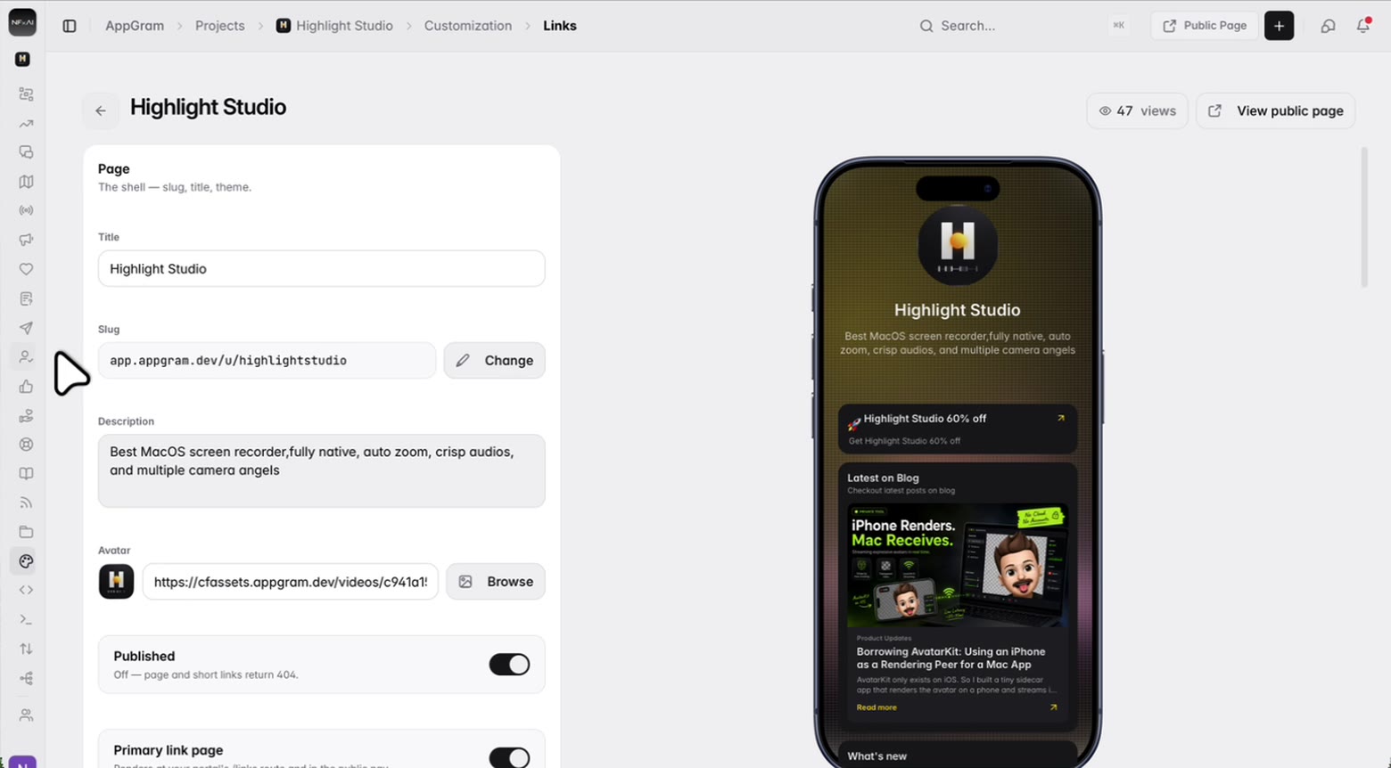
Your avatar, your name and a line about what you do, at a slug you choose and can change later. Publishing is a switch — while it is off the page itself returns a 404 rather than something half-built. It can also take over your portal's links route, so the link in your bio and the one in your nav are the same page.
The look
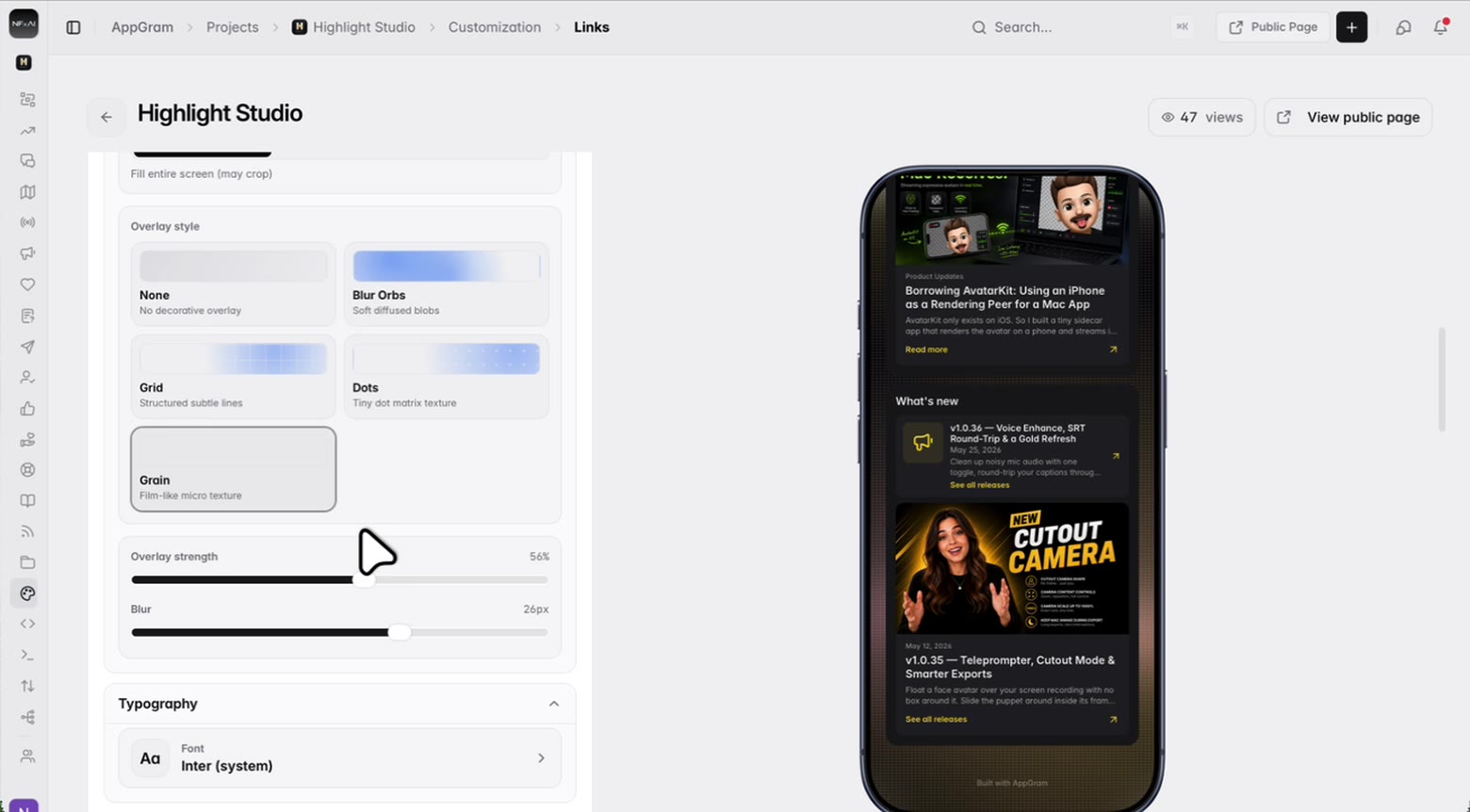
Start from a preset and then argue with it. The background takes an image with a texture laid over it and a blur behind the cards, the buttons are solid or outlined or ghosted with the corner radius you want, and the links either stack in a column or sit two across.
The links
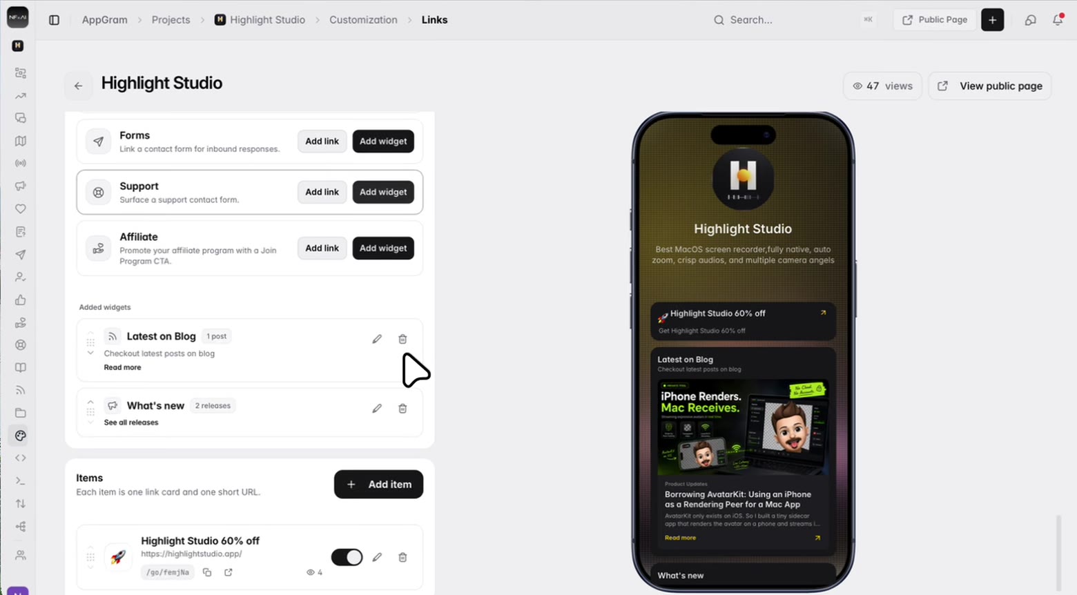
Each card you add comes with its own short URL beside it, ready to copy. So the same destination can go on the page, in a newsletter and on a slide, and you can still tell which one people actually used. Clicks are counted per card, views per page.
Pull in the rest
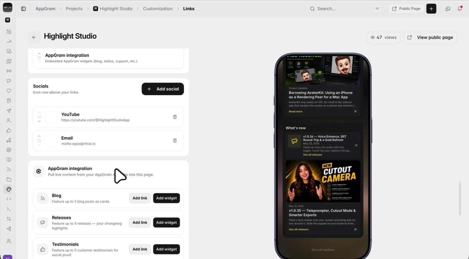
A bio page normally goes stale the day after you build it. This one reads from the modules you are already keeping current — your latest posts, your last few releases, the testimonials you approved — and renders them as cards on the page instead of links away from it.
Who uses it
For founders
Your product link, your latest release and your best testimonial on one page — and it stays current because it is reading the modules you already maintain rather than a copy you pasted in and forgot.
For marketing
Every card has its own short URL and its own counter. The same offer in a newsletter, in a bio and on a talk slide stops collapsing into one undifferentiated number.
For creators
A background image with a texture over it, your font, your button shape, your section order. Not a template with your logo dropped into the corner of it.
Connected
Every module writes to the same customer graph, so data captured here shows up wherever it is useful — no connectors to authorize, no sync to babysit.
See all integrations →AppGram modules
FAQ
At a slug under your AppGram portal, which you pick when you create the page and can change afterwards from the editor. You can also mark it as your primary link page, in which case it renders at your portal's own links route and appears in the public nav alongside everything else.
The page returns a 404 rather than a half-built draft. Individual links can also be switched off one at a time without deleting them, which retires a short URL while keeping its click history.
Yes. Every card carries a generated short URL beside it with copy and open actions, so you can put the same destination in several places and still see which one people came through. Clicks are counted per card and views per page.
That is the part worth having. Blog posts, releases and testimonials embed as live cards — up to five each — and your status page, surveys, forms, support form and affiliate program can each be added as a link or as a widget. They stay current because they read from the modules rather than from something you copied across.
Presets to start from, then the palette, the font, the layout as one column or two, the button style with its corner radius and shadow, a background image with an overlay texture and a blur, and the order the sections appear in. A phone preview sits beside the editor, built from the same components as the live page.
Yes, as an icon row above the links — reorderable like every other list on the page.
Get started
Everything you were bolting together — feedback, roadmap, changelog, help, support, status, forms — in a single workspace with one API and one bill.
Cancel anytime. Yours to test on real customers.